Showing posts with label Trends & Styling Conventions. Show all posts

Final Outcome and Evaluation

Here it is! I had a few issues with the printing, being charged double what I was quoted and then having the binding fall apart not once but twice! But it has been fixed and the poor quality of printing was completely down to me not managing my time efficiently and going somewhere that would print quickly, rather than go somewhere that took longer but was better quality.

However, overall I'm happy with the final product. There is definitely room for improvement which has been explained in my evaluation, but the success overall lies in not only the final outcome itself but the process. There have been lots of hurdle that I have had to overcome, and lots of problems that I have had to solve and I am really proud of myself for how I have handled these. I feel as though I have grown as a professional and applied myself to learn things that I may not have if everything in the project ran smoothly. It is for these reasons that I wouldn't change any part of the process. I  think I could have liked to have had a wider range of shoots and better quality of binding, but overall I think that the project was a success and conveyed what I set out to portray.


EVALUATION
At the start of this project I initially proposed to create a visual coffee-table styl­­­­e book that would explore the link between the skin and five separate sets of emotions. I also aimed to create five short films to accompany this, to create an emotional response in the audience that could not be reached through the visual medium of a book alone. As the project progressed, however, the nature of my project changed significantly to be a celebration and exploration of Skin as a form of identity, and focus more widely on human responses rather than pinpoint individual emotional reactions. This was partly down to the research that I compiled where I drew inspiration from body sculpture, and partly down to my own experiences with skin, eczema and scaring.

This project has undoubtedly pushed me to increase my capability in industry-relevant skills and has forced me to work autonomously, setting goals and challenges for myself and problem solving appropriately. A crucial example of this is the vast improvement in my skills in digital applications, especially in Photoshop, Indesign and Final Cut pro. This has been primarily self taught, but has also been encouraged by regular support sessions with the I.T technician. I have been able to use digital manipulation to emphasize the emotional tone of my project in post production and therefore explore the concept on a more solid level. This is something that I thought that I would have to rely on the photographers for, and was put in jeopardy when Susann left the project. As such, a huge benefit of learning these skills is that I have been able to take control of factors that I would have had to previously rely on other people for if things do not go to plan. I feel immensely proud of my progression, and confident enough that I would list this as a skill when applying to jobs in industry. This is a hugely beneficial thing to come out of this project - it has forced me to improve my skills for industry and also think and communicate more like a professional and create mini briefs for myself to reach my goals.

As to successes of the project, I believe that I succeeded in creating an original and visually stimulating piece of work that merges emotion with technological factors that are commonplace in today’s industry. The QR code is an essential method of promotion today and strikes a happy medium between being forward thinking and innovative, yet still attainable enough to be easily accessible to everyday people.

There were a few ideas that I originally had for the photographic portion of the project that proved unsuccessful, such as using wax as an extension of the skin and body. But although this was tested and still unsuccessful due to lack of facilities on the scale that I needed, I believe that I efficiently found solutions to the problem, using aesthetically similar materials that were easier to work with and fit into the concept and design of the original shoot and concept. I was able to solve these problems quickly and effectively, proving that the project has helped me to think on my feet when things don’t go to plan. This will be invaluable in industry.

The most challenging aspect of this project for me was relying on and organising other people. It’s easy enough to organise a photoshoot every now and then, but organising multiple shoots when everyone else also was busy with FMP deadlines, with limited studio time, was something that I found very frustrating and difficult to manage. I found that surrounding myself with the right team was imperative to the success of the project and acted as a support system. The final team of people that I shot with were as involved and as interested in the final outcome of the project as I was, which I think was key in making an effective piece and having the shoots run smoothly.

Another thing that I found challenging was the budget, and this definitely caused a few limitations for me especially in the way of printing and binding. If the budget had allowed I would have looked into more expensive materials to create a wider range of visual experiences but it became apparent quite early on in the project that the budget that I had initially planned was not realistic to what I could afford. Although this did not set me back in terms of my shoots, it was an issue when I came to look into printers.

A major threat throughout the project was the possibility of people either not being available or dropping out. Unfortunately the latter occurred with my initial photographer/videographer half way through the process, and she failed to pass on to me any of the material that we had agreed on. I finally received unedited clips and images from her, and thought that my lack in video editing would compromise the outcome of the project. I managed to overcome this however, by falling back on my backup photographers and utilising my newfound skills in Final Cut Pro.


There were a few major issues that needed to be resolved throughout this project, mainly because working with the skin as a medium is different to creating regular makeup looks. There were different materials I had to familiarise myself with and new methods of makeup application that I had to utilise to create the effects that I wanted. I also had to familiarise myself with foreign technology as well as teach myself completely new skills from scratch. The key to resolving these issues was preparation and anticipation. I had initially planned for disasters to happen, which meant that I had at least some basic idea of how to fix a problem if it came along, which I could then build upon. This is a really important skill that has increased tenfold though completing this unit and something that is invaluable to my career when I go out into industry. I’ve also proved to myself that I can set myself challenges and solve them in a professional and effective manner.

The overall quality of my book definitely requires some improvement. It was bound poorly; causing some of the pages to go out of alignment and in some cases fall out. Although I could blame this on the company, the blame primarily lies with me for not managing my time efficiently enough to go to a better printer. I chose a company that could do the job quickly, and although I had several meetings with the printers I took the quality at face value without testing examples and actually touching and feeling the books for poor binding prior to ordering. This is something that I will carry with me in my career when I collaborate with other companies in the future – quality is important and should not be substituted for poor time management.

If I were to further develop the project then I would like to go even further with the methods that I used to explore the skin and its responses. Exposure to the work of artists like Bart Hess and Juke Schoorl determines that projects like this can be emphasized sculpturally, texturally and aesthetically and this is something I would like to expand upon given a larger budget and timespan. I would also have liked to have fine-tuned my Final Cut Pro skills and make the videos that I created look just that bit more professional. I learnt how to edit after I filmed, and if I had reversed the process I think I could have gotten shots that would’ve made for a better quality video.

Overall I have created something unique with a creative, diversity driven concept behind it. Diversity is fast becoming a prominent factor in the beauty industry with campaigns like Diversity Now and models like Shaun Ross and Winnie Harlow driving this forward, but the subject of skin is still very much a taboo subject when discussing beauty and fashion. This book addresses the issues that are still being ignored in fashion. It was surprising and refreshing that this project actually made me feel hugely positive of my own skin. The book is positive, with quirky colour schemes and edits that beautify skin and all of its distinctions. I think that this is important to acknowledge not only within the beauty industry but in every day life as well.


Colour Themes and Trends


A huge factor in making my book reads smoothly and everything runs consectively is ensuring that there is some consistency in not only themes but colour schemes as well. 
As I reach the point where I need to start thinking about the aesthetic of each chapter of my book and put it together on InDesign, this is something that needs consideration.

To do this I have utilised skills previously gained in our Trend Package unit, where I gained a deeper understanding of colour trends. I used WGSN to build upon my initial ideas, to build a deeper understanding of current and future trends and ensure that my book will adhere to these in some way or another. 

Each chapter almost followed its own colour conventions and had a natural colour scheme. If there were any anomalies in this I was able to fix this through photoshop, slightly changing background colours to ensure they matched the other shoots in the chapter. Although I was conscious of this and planned for colour trends before shooting, the main function of creating the above colour package was to ensure that I maintain these themes and trends while completing post production, and putting the book together on InDesign.

Creating this was a good idea as it served as a compact tool to aid me in maintaining themes. Colours were inspired, as stated in previous posts, by combining the shoot that I already planned with colour packages from WGSN, which allowed me to link my ideas with those of industry and ensure that my shoots would be relevant.


Video Analysis

CRACKS AND GROWTH


Here is my final Cracks and Growth video. It was successful in terms of portraying skin textures in a creative way but in all honesty this is my least favourite of all my videos. I  think it could have been executed better by having a more colourful spectrum in it, and having the hand move in different ways with multiple camera angles. Its a good starting point but there is room for this to be explored further in video format, and this version doesn't differ much from the draft except that it is cleaner and a bit neater.
SILVER LINES
The hardest thing about making and editing this video was applying the right mood. This came mainly down to music. Most royalty free music either had a very sombre tone or a very jaunty, almost comical tone. I have found that sombre tones tend to make videos seem more professional, but it wasn't right for this video in portraying what I want to portray - I wanted the model to be showing off his skin, to be happy in the emphasised silver lines of his hands and have the video as a sort of appreciation of differences in skin, but the somber tone put a negative spin on the whole thing.
After finding the visual effects that I wanted to use I found a mystical tune that I think fits really well with the tone of the film. Its bright, but not comical while still giving an emotional serge in a positive way.


This is my favourite of all my videos. I love the colour spectrum and I think the whole thing works nicely. It makes for an interesting watch because there are video effects as well as a model moving appropriately. There are some bits that could have been edited in a smoother way, but overall this video makes me proud of my process in video editing and Final Cut Pro, all of which was self taught.


IDENTITY

I've been in two minds about this video ever since I shot it. Im still undecided as to whether this portrays my idea of identity or not. The shoot was Susann's idea and was the reason we started to have creative differences, because I felt that it didn't really relate to my project.

However we found the mannequin and I really liked the idea of incorporating this smooth, perfect porcelain idea of a human being in comparison to the flaws and lines that real skin has. I think the idea is good, but here are a lot of ways that it could have been portrayed better. Down to getting the material so late from Susann, I wasn't sure that this video would even ever happen and decided to work with it given the time that I had left by the time I received the raw clips.

HUMAN CONDITION

This was another video that I thought was successful. It succeeds in creating an emotional response in the audience and I really like the aesthetic of the makeup application to the odes chest sand torso. I made the conscious decision to have the male topless in order to exhibit and emphasise the motion of his breathing, and also to because I thought it would be fresh and clean when exposing the skin in its naked form.


Some shooting and editing could have been carried out in a more professional way but overall, with all the ups and downs that the videos gave me and not knowing if they would even get made, I'm really quite happy with how they turned out.  I was able to fit music that fit the one of the piece and inserted breathing sound effects, which I was able to slow down or speed up, depending on the mood that I wanted the model to portray.  This breathing effect, which we also completed in shooting with exaggerated movements for camera, ties up the whole video and puts some meaning behind the perspiration.

The video allows the audience to come to their own conclusions about why the male is perspiring and breathing heavily. Is he scared? Has he exercised? Is it sexual?  The skins reaction is the same and  video is successful in portraying the relationship between emotions states and their physical response.   If I were to re-do the video I think I would have liked to really exaggerate the perspiration and go all out with it, perhaps adding a spray to the body to show a gleam on the skin that compliments the larger beads of sweat that were made with gel. That being said, however, I do really like the contrast between the brands of sweat and the models matte skin so it would be hard to pinpoint which would work better aesthetically.

Identity Shoot and Edits

ANALYSIS
I worked with Lauren again on this shoot and she's always great to collaborate with. She shared creative ideas while letting me play with the concept. Her skills in lighting and photography meant that I didn't have to use any post production on the images, except for adding the odd image to the background. I want the skin to really stand out of these photos so that is another incentive for me to not use photoshop on this shoot.
I used my own hands in the shoot because they are lined and textured and I thought it would be beneficial to showcase natural diverse skin as well as the unnatural. It also makes for an interesting aesthetic. I took inspiration from vitiligo and birthmarks and used makeup to recreate this type of patterning. The cutesy background colours cast a pleasant delicacy on hands that may been seen as not ideal were they in another situation. I was not the best hand model, however, and kept shaking throughout the shoot meaning that a lot of photos were unfocused. Lauren was patient and helped me to keep my hands steady in front of her camera.

The pink background that Lauren and I agreed on reminded me of a relevant trend that I had seen on WGSN and I thought the two would work really well together. The "Graceful" theme has been referenced in a previous post and revolves around a pastel colour scheme, focussing on pinks. Incorporating this into my shoot really gave the images a modern, cutesy edge which is popular with my artsy target audience, giving me more of an edge when maintaining their interest. Soft Pop built spun this theme through collage and popular culture "sticker" like appendages. I want to ply with this to see if its something that can be incorporated into my own work.


Above is one of the final images, to which I have applied the editing techniques as stated above. I did this by duplicating the daisy that is on the ring of the index finger. The daisy print is extremely popular with my demographic at the moment, so it will appeal to my target audience and also ties the shoot together and is aesthetically pleasing. I haven't photoshopped the skin itself to maintain the authenticity of the texture. 

FURTHER DEVELOPMENTS
I realised that  absolutely love making up and shooting hands. They're all so singular, yet they're all the same. They move differently, the skin fits them differently on different people, some are aged, lined, soft, dry, the diversity is infinite. I wanted to test some more while was was with Lauren so I went back to the Silver Line shoot from the beginning of the project. I have made the conscious devious not to photoshop these images bar for the backgrounds in some cases. This is to show the authenticity of the texture of the skin which I feel really gets to the core of the subject.


Identity Shoot Design

This shoot shows how skin is seen as our first method of deciding a persons identity. I will take a birthmark over the models face, which will be inspired by the Rorschach inkblot tests - a psychological test used to identify a persons deep psychological personalities. I like the link between this test , showing inner identity, and the birthmark which shows outer identity.

WGSN has proved a really good source of inspiration for patterns and textures that will influence and update the inkblot-like stains that I am looking at. The above, to me, shows this sort of theme distorted on a range of different bases, which is something that is key when designing my skin patterning.

UPDATE
What if I didn't use the face, but used the hands to portray this. The chapter is, after all expiring how our outer identity connects to the skin without looking at a persons facial features. "The skin is all we show." Hands are intimate, they can tell a story of a person and serve as a emotional connection between human beings. I've decided to adapt this shoot to the hands for variety as well as concept strength.


Jealousy Final Shoot

SHOOTING PROGRESS

Today we shot the look and I got to really experiment with the "bound" factor. I ended up incorporating different materials to experiment with other ways to portray this. I used elastic and string in a verity of different positions and felt as though I really acted as creative director rather than just a makeup artist.


ANALYSIS
I feel confident that we got a good number of images to have this be a strong concept through the book and, if the previews are anything to go by I don't think that I will have to reshoot this. The photographer Lauren achieved the lighting and mood that I had envisaged even without post production, meaning that editing will only be minimal and images will look more professional. The shoot has the potential to match the Monumental trend that I was originally inspired by from WGSN.
I work incredibly well with Lauren and together we create a professional yet relaxed shooting atmosphere that allows creative ideas to flow freely. The model was confident and managed to hold poses that may have not been the most comfortable! She was able to portray the sense of emotion that I had needed.
Makeup application went smoothly and I was able to pull off what I had designed on a face chart in real application. It appears sharp on camera and although the metallic bleached out a little, this was expected and is easily fixable in post production.
The "hair cage", although previously practised did not run as smoothly as I would have liked it to. This was down to a corser hair type, which caused strands to be static and hard to control and I also should have practised the night before as to remind myself of the precision that I needed.


I have enough confidence in the quality of Lauren's work that I have agreed to edit the photos myself, which will take some of the worry out of having to wait to see the final photos and also means that I can start creating the post production effects that I want to add (see mood board) To do this I have self taught the techniques that are required by watching photoshop tutorials on Youtube, and this proved really successful. Examples are below.


I am really happy with my growth and progress in digital systems like Photoshop, Indesign and Final Cut Pro over this unit and would now feel confident in listing these thins as a skill when applying to jobs that require this in industry. 

I have also used Photoshop to manipulate the tone of the image to better match the mood that I had originally planned in the previous post, which was inspired and tonal to the "Monumental" trend package. To do this I applied basic beauty editing along with cooling filters to the picture apart from the eyes, which is emphasised to give a molten appearance. This was necessary due to the camera bleaching out the metallic gold somewhat, which was planned for in the design. The two photos below show the edited tonal version of one of the images from the shoot, next to the unedited, warmer version.


Jealousy Shoot Design, Styling and Inspirations


MONUMENTAL PACKAGE FROM WGSN


The idea for this design was to have two creative takes on jealousy - the first uses the hair as an extension of the skin to show how jealousy is trapped in the head of the individual, the second focusses makeup on the eyes to express a "see no evil' connection between expressions of jealousy.

WGSN has proved to be invaluable when looking not only for inspiration but also for tonal aspects to inspire me when creating a general mood for each of the shoots that I am preparing. Their "Monumental" trend package hits a similar note to the absence I am aiming for with this shoot, while giving tonal and textual inspirations. 


Gold features heavily through WGSN, a colour that I had originally wanted to feature for the strong eyes loo of the second jealousy shoot. I was glad to see this, because I now can link my initial thoughts and ideas to legitimately certified trend experts, meaning that my shoot will have some viability in terms of fashion relevance in the industry. I also feel it is relevant to this shoot because, to me, gold has a temperamental meaning - it is used interchangeably in media for both light and dark moods. It can be light and magical or dark and for boding and this will give a deeper mood to the shoot for more connectivity to the audience.

TEXTURE AND TRENDS
Texture is fast becoming a strong theme through my shoots - it illustrates skin in one of its most natural forms. Therefore I want to incorporate this into the makeup to create a connection between skin and the makeup itself. Gold has many textures so I created the board below as an inspiration board to showcase textures that have inspired me through this shoot design. Its important to me to know the different ways that gold can be displayed, moved and applied before I start designing the makeup in depth. 

I have also incorporated the hair into this, to display different ways that other creates are taking on the ask of crewing textual "hair cages" and then see how I can merge the two together to ensure that the shoot flows nicely. 

TEXTURAL INSPIRATION BOARD MADE BY MYSELF.


UPDATE
The below mood board was created after incorporating the above factors. I now have a really specific idea in my head for the aesthetic outcome of this shoot including styling and post production. Styling will be smile yet effective - I have sourced a mesh body suit that compliments the stringy texture of the "hair cage" while remaining current and fashionably edgy. I have chosen a model who I know is talented and who will fit the heme of the shoot. 


Initial makeup tests taught me a lot about the application on metallic paints. I do not like the second look and i don't think it early portrays what I want to portray. The first eye is what Im going to work on. I need to use more aggressive brush strokes over a larger surface area to create a more textured look based off of the textural research that I've done above. 


Cracks and Growth Shoot Design


Cracks and Growth is designed to appreciate the different textures of the skin and how this should make us strong, and encourage our personality to grow rather than shrink back. I have tested with Fullers Earth as stated in a previous shoot to emphasise the textural difference in skin. The design is similar to that of desert floors, and this is a really intreating starting point for inspiration of how I should apply and manipulate the Fullers Earth to create this effect. To do this I needed to look closer at the texture of desert floors and different landscapes that are exposed to drying out or cracking, and I have created the textures board below to ensure that I stick to this when I test later today.

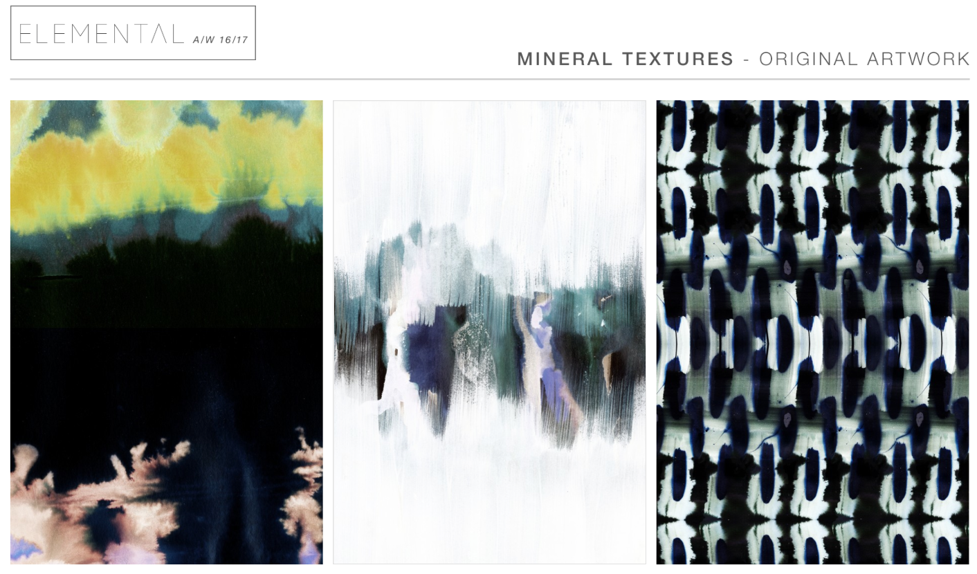
A look through WGSN has shown that this sort of elemental texturising is current and predicted for A/W16/17 which again allows me to carry on in the knowledge that my project will relate to industry trends, enabling me to viably connect my project to a fashion based landscape as well as a beauty/diversity built audience.


One of the technical instructors has advised me that, although it appears white, the Fullers Earth will more than likely photograph grey. She suggested adding Aqua Colour to emphasise the white colour which I have re-tested with and will use when I do the final shoot. 


First Week of Shooting

Today was the first day of shooting. For time management purposes we decided to shoot video clips, followed by photographic portions of two models with different makeup and styling designs. 

SHOOT ONE
Analysis and Evaluation
Shoot one was intended to shoot Silver Lines and the beads of sweat on a male model. The shoot was successful, due to the fact that I had tested both of these techniques multiple times previously so it allowed me to remove the negative factors from the method of applying these techniques to make for the best aesthetic outcome. The model was very accommodating and had the right physique and camera presence needed for the style of the shoot. 
Applying the sweat beads to dry, matte skin increased the intensity of them on camera which again came from testing. I mentioned before that I was interested in trying the silver lines technique on different skin tones and this worked nicely, and increases the factor of diversity and skin celebration that runs through my book. If I were to shoot again, I would add shoot the two separately, because in my haste to shoot I have realised that Ive got two different themes in one photo series, which will make it difficult to create clear themes and chapters when it comes to putting together films and book chapters.


Sweat example from shoot one.

SHOOT TWO
Ananlysis and Evaluation
Shoot two was intended to show stress, the concept had the model (Meg who I previously tested with) scratching at her skin to reveal pigment beneath. It became apparent very early on that this was not working. The shoot focussed on the scratch, which gave me a block about the makeup design because the face was not a main focus. As hard as we tried, the scratch looked fake with the method that we were using. The model looked very commercial and did not suit the tone of the shoot, something that I should have realised in the testing. I made unsuccessful decisions in regards to makeup design and model choice for this particular shoot and that is purely down to poor planning on my part.
I am using this as a test and putting it down as an experience that has taught me mistakes not to make in the future. 


Skin Tests IN STUDIO

In a previous post I tested the effect of MAC Mixing Medium used to create beads of sweat and skin textures, and although I liked the tests of this I needed to see how it would look on camera, on a real model with lights and the suitable photography equipment. Will it be visible from afar as a head shot? Can you see it from a full body shot? Will it even show up in the lights? Will the jelly-like product reflect off the lights oddly? These types of tests will carry me through to industry, reminding me to be thorough and prepared in the knowledge of how my products will react in certain scenarios.

I completed three different tests to be thorough. The first (pictured below) tested small round shapes with the mixture. These were my favorite in initial tests but I was worried they wouldn't show on camera. The results are below:


Editing determined how much the "sweat" creations show up. For example, the first has a higher saturation and the small bumps on the forehead are a lot more visible. The second image is cooler, with a higher exposure and this makes the bumps disappear. I don't think they would be distinct enough to use on film in a head shot position. 

Next I wanted to make the bumps a bit bigger, so I dragged the mixture in a downwards motion to create a dew-drop shape which resembled sweat more than the first textures:


Again editing determines how visible the mixture is. Although, even in the first photo with a higher exposure, the drops are more visible than in the first set of tests. I think that excess is going to be the key with this, to get the most use out of it on camera. 

If this is true then for my next test I wanted to add a lot more, and add some texture to the gel by striking through it with the tail end of a pin-tail comb, to see if maybe added texture would catch the light better. I'm not fond of this technique but I need to see if it looks good on camera. Results are below:


This actually seemed to have the reverse effect. Thank goodness for testing! Once again, I edited them in two different ways to see if that made a difference in how the gel is picked up but I don't think that it makes a big enough difference to warrant using a technique that I'm not as fond of as the first or second tests.

ANALYSIS AND CONCLUSION
The second test seemed to work the best on camera and I think that I can work with this technique on film. I still really like the idea of the first texture but in order for this to work on film it will need to be used for close up shots only, because it doesn't show up enough for anything other than that. I've come to the conclusion that this technique will have to be used mainly for close ups, which I believe can work on film. 
Doing these tests paid off positively because I now know how this new product and technique works on camera. This is important because makeup almost always looks different to the naked eye than it does on film. I like the idea of this gel being an extension of the skin. My next step will be to test it up close on film to double check that it works. 

NOTE
I usually have trouble getting that dewy glow on a models cheeks to work effectively on camera but I feel like it was really effective on this shoot. This came from mixing MAC creme highlighter with a Vaseline-like mixing medium, proving that experimenting with products can sometimes be more beneficial than sticking to just one. I'm thinking of using this in an intense way to create hyper-sweaty looks for the project, maybe fitting into the stress theme. However, it has recently occurred to me that the dewey skin could be reflecting light through the sweat beads from behind and therefore causing them to not show as much.


THE HAIR CAGE - Hair Tests, Photographer and Model Tests.

I'm really intrigued in using this sort of cage hairstyle to emphasise the state of emotion being entirely conjured inside of an individuals own head, using the hair as an extension of the skin.  She is trapped by her own body. The style was based off of this drawing that I produced:


 The first time that I tried this hairstyle it was very messy and almost unrecognisable as a hairstyle:


Obviously this is not an aesthetically polished hairstyle but as a first attempt it shows that the hairstyle is doable and gives me an idea as to how it will appear on camera. I also learnt from doing it the first time that it was important to use gel or wax on the connecting strands, and to take hair from further back on the head. It is imperative to test this style out on a real hair model rather than the fake head, as working with real hair is a lot different to the synthetic hair of the heads. 
Secondary tests incorporating the above factors produced the following images:


Although they are unedited images, they were very successful.  It really made a difference working on real hair that was long enough for me to hide pins and bands. I used gel to neaten up those connecting stands and it looks a lot more professional. Its not quite industry ready but its a lot more aesthetically pleasing than the first attempt. The shoots show different angles of the hair (one side had  a connecting stand to the rest of the hairstyle and the other didn't, so that I could see if this was necessary - it was not) Im happy with the way that it looks from different angles and I think that will work from this frame as well as for the odd close up shot when considering final production. I'm really pleased with my progression in this, especially as hair is not my strongest area of work.


Aesthetically, it looks high fashion and akin to something you may see in industry in popular hair magazines or websites. This can also serve the purpose of increasing my audience to hair stylists or hair enthusiasts. 


OTHER OPPORTUNITIES

The shoot was also an opportunity to test with a new photographer, Heather Smith and a new model, Meg McDaniel. This is important because if anything were to happen that would cause Susann to drop out or miss a shoot, I will need to have a back up. Ive worked with Heather before and I can see that she's growing as a photographer and I'd be happy to have her involved in the project if needed.


Meg is a competent model with previous modelling experience so I'd like to have her involved in the project now that I've seen her modelling abilities on camera.


WHAT DIDNT WORK AND WHY

The hairstyle needs securing better if the model is going to be mobile in the video or while changing poses when shooting. After a few shots in different positions, the hairstyle fell:


It is imperative that this doesn't happen on camera on the day of filming, so my next step is to find a better way of securing this hairstyle  and/or hiding the bands that keep it together.


PLANS FOR NEXT TIME

Use see-through hair ties and maybe use more hair from the back of the head so that the actual plaited section is longer, and therefore easier to tuck and hide behind the front section. This section needs to be secured better, using back combing to give the pins something to grip to better.

Wax on, Wax off

I have been so inspired by Bart Hess recently, especially his work with wax. The wax garments that he constructed shout concepts like constriction, limitation and restraint. The breaking of the wax is almost like an incredibly important moment of freedom - breaking out. The wax clings to the skin but only as long as the skin will let it, breaking and cracking the moment the model moves. This is really compelling for my project.

I tested this on a much smaller scale by melting a candle in some hot water on the hob (see below). I poured the wax into a cup of cold water and submerged my fingers into it, continuing to pour the wax. The water ensures that you don't burn yourself on the wax and also lets the wax create wonderful frilled patterns while it sets. See results below.

I absolutely love the aesthetic effect that this process creates. However there are a few issues:


Practicalities:

I had to heat this up at home, which was messy and time consuming. I wouldn't be able to melt this wax at uni in the studios because there are no heat sources, and if I do it at home the wax will set before I can get to the studios to apply it. Potentially, I could apply the wax to the model at home but the set wax was very delicate and I think that it would crack or crumble on the journey to the studio. The fact that I can't do this on a large scale (not having a tank of water big enough to hold anything larger than a few fingers) means that visual focus would have to be ON those few fingers or it won't be effective.

UPDATE
After a discussion about this in a tutorial, my tutor has suggested using the microwaves at uni. I will need to test this to ensure the wax is suitable for microwaving.